Thursday, February 21, 2013

Review: 100 Things Every Designer Needs to Know About People

Work is making me do a book report... A BOOK REPORT!

Okay... by "making me" I mean I volunteered to speak about something I liked at this week's Instructional Design lunch & learn, and now we have to write about what we talked about. I reviewed a book, therefore I'm writing a book report.

Admittedly, it sounds way more amusing the way I initially put it.

Anyway, since I'm writing up this book report for work I figured I may as well share it here too.


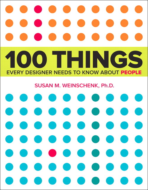
Title: 100 Things Every Designer Needs to Know About People
Author: Susan Weinschenk

What's it about?

Never before have you read a title more accurate. It's exactly what it says it is: 100 facts about people (and specifically their minds) that designers, or anyone really, should know.

What's so great about it?

This isn't just a collection of facts based on someone's gut feeling: every point is based on scientific research. This book talks about topics like how people make mistakes, focus their attention, remember, and are motivated, all in layman's terms. It then tells you how you can use these facts to your advantage when designing anything.

So it's brain science in easy to digest nuggets that will help you design your learning/websites/textbooks/apps/whatever in ways that are more effective. Plus, it identifies its sources, so you can check the science for yourself.

What's going to drive me nuts about it?

Because it covers so many individual topics, trying to read this thing cover to cover will give you brain overload. I'd usually make it though about 5-10 topics in a sitting and then have to stop, put the book down, and process. And I say this as someone who's usually happy to read constantly for hours. It's good, but it'll likely be a slow read.

Anything else?

The colour scheme of the book is ridiculously pleasing (what, these things matter to me!).

I'm too lazy to Google the book. Where can I buy it?

*sigh* Here you go:

Monday, February 18, 2013

What Games Aren't

Gamification is definitely one of the more polarizing topics to bring up in instructional design communities these days. That said, let's put the whole "is gamification bad or good" discussion on the backburner for now and acknowledge the fact that, regardless of how any of us feel one way or the other, gamification projects are definitely happening. Unfortunately many of these projects are being proposed by people who don't understand games in the first place.

I've been a gamer longer than I've been an educator, so I admittedly have more than a bit of emotional investment in wanting people to see the value that games have beyond "for funsies". I think that's why I get so frustrated when I see people and companies trot out gamified learning that clearly has made some bizarre and inaccurate assumptions about games in general.

So, from this gamer to non-gamers everywhere, here are two assumptions about games that I'd LOVE people in our industry to stop making.

1) Learning content + a game-like setup = better learning

Shoving the facts you want learners to know into a game doesn't always lead to good bang for your buck. Just ask anyone who grew up in the 80s. We were subjected to a major wave of educational games, many of which weren't particularly effective. Sure, we have fond memories of titles like The Oregon Trail and Sim City, but for all the endless hours of play time we put into these games I think it's safe to say we didn't actually learn much from them.

The intent was good: create engaging games that will also pass on knowledge to the player. Unfortunately, most of what kids learned from these games was simplistic surface information. I mean, seriously, no matter how long you play The Oregon Trail the most you're going to get out of it is that inventory control is important and dysentery is bad. That's not a lot of learning considering the average amount of time a player spent with the game.

Modern gamification sometimes suffers from this problem as well. The group working on the project is so excited about the idea of a gamified system that they don't realize how little their game is actually teaching. Just because something has been turned into a game, doesn't mean that it's actually going to impact the learner much.

2) All games are fun

Games are fun, that's why gamification keeps learner interest, right?

Um... no. Some games (depending on your standards, MANY games) are unbearable, unenjoyable pieces of junk.

Non-gamers typically only have exposure to successful games. You know, things like World of Warcraft, Halo, Angry Birds, or Super Mario. They rarely have much experience with the real gamer experience: wading through a myriad of shoddy, half-baked games in order to find titles that are actually worth your time. Some of these are legitimate efforts to make something great that just didn't turn out as planned, some are cheap efforts to cash in on a trend or licensing tie-in, but regardless of intent, many are just plain not fun at all.

For a great example, check out the 1982 Atari game E.T. the Extra-Terrestrial, a title notoriously considered the worst videogame of all time. This cheap attempt to take advantage of the popularity of the movie lead to a game that's by all accounts tedious and incoherent. Here, see for yourself:


Google "worst videogames" and you'll get list after list of games this bad. Clearly the mere act of using game elements does not, in fact, lead to an enjoyable experience. But, unfortunately, there are way too many people making gamified systems who don't understand this simple fact.


So if you or someone you work with has been asked to create a gamified system make sure you start off with the following:

  • Involve someone who already "gets" gaming.
  • Try playing games yourself and get a feel for the experience. Play both excellent games AND terrible ones so you can learn the difference.
  • Continually check that the gamified system you're designing is actually teaching something both meaningful and worth the investment of player time.
But before you do any of this, really ask yourself if a gamified system is actually the right tool for the job. It's surprising how often it actually isn't.

Sunday, February 3, 2013

Let's chat about skeuomorphism

I had planned to write a detailed post on skeuomorphism, but then Scientific American beat me to the punch with this article that sums up a lot of what I was thinking. So, instead, I'm going to write post on what I feel the article left out. Your pre-work is clearly to go read the article if you haven't already... don't worry, I'll still be here.

...

Good. Now we're all on the same page.

Here's the thing: I don't believe skeuomorphism is inherently bad design. Think about things like the Trash or Recycling Bin on a computer. Even to the biggest technophobe its purpose is instantly understood. That's good design at its finest.

Even my dad knows what this does. That's a miracle.
Skeuomorphism works, I mean REALLY works, when it's being used to acquaint people to something new by using the look and feel of something they already know. It's also good for triggering the emotions people have about the product it's replacing (I know not everyone feels this way, but the page turn effect in iBooks always triggers that love I have for the traditional paper book experience). Finally, when done right, it sometimes just looks cool.

But when skeuomorphism goes bad, boy is it ever terrible. Some people make the mistake of seeing it as the pinnacle of design when in reality it's just one of a myriad of great options that should only be picked if it's the right tool for the specific task you're trying to accomplish.

As I see it, there are two main ways people tend to shoot themselves in the foot with skeuomorphism:

1) Form over function
I'm all for designing things that are attractive, but the job of great design is to make sure that the beauty of the thing you're designing doesn't interfere with the functionality of what it's actually supposed to do.

Here's a hypothetical example. Let's imagine someone designed a delightful phone app that both resembled and functioned like an old rotary phone.

Man, does looking at this thing make me feel old.

Great. Rotary phones have a certain charm to their look and a fun retro appeal... Where's the problem?

The problem is functionality. Who here remembers how slow it was to dial on them? It was painful how long it took to dial a simple number (and heaven help you if you had to make an international call). This is an instance where there was a distinct reason phones with a touchpad took over, and also distinct reason the touchpad design is what smartphone makers decided to emulate for phone apps. It's a noticeably faster and more efficient experience.

While the design of a skeuomorphic rotary phone app could be stunning to behold, the actual user experience would be so much worse than the alternatives that most people would reject it. Form over function is always bad design.

2) Forgetting that just because it looks like a real thing doesn't mean that it isn't also hideous
And here's the real problem with Apple's recent attempts at skeuomorphism. Apple is a company that for years had been known for being on the cutting edge of sleek and sophisticated design. Then they gave us this:

Ugg! My Eyes! The horror!
And people flipped out. The colour... the faux leather... the terrible fake stitching. This was some deeply ugly stuff coming out of Apple for the first time in a very long time, and the aspects about it that were so painful were the ones associated with skeuomorphic design.

Because of this, a large number of people concluded that skeuomorphism was inherently a bad design choice. However, I'd argue that this proves no such thing. The real problem here is that the designers phoned in the look and feel of the newer Apple designs, depending on the misguided idea that simply following the principles of skeuomorphism would make something that looked great.

Look, there is no magic formula for design. Give me any design principle you can think of, and I'm sure I can find you plenty of instances when people have made a fugly mess while using it. Apple made the mistake of being so focused on replicating the look and feel of a leather notebook that they forgot to check to see if said leather notebook was actually attractive.

It wasn't.

That's not a problem of skeuomorphism, it's just pure bad design, and unfortunately it's given skeuomorphism a bit of a bad rap.


So that's my take on the whole skeuomorphism issue. I'd love to get your opinions on it. Also, it would be fun to get some additional examples of times you've seen it done either brilliantly or painfully poorly.